Purpose:
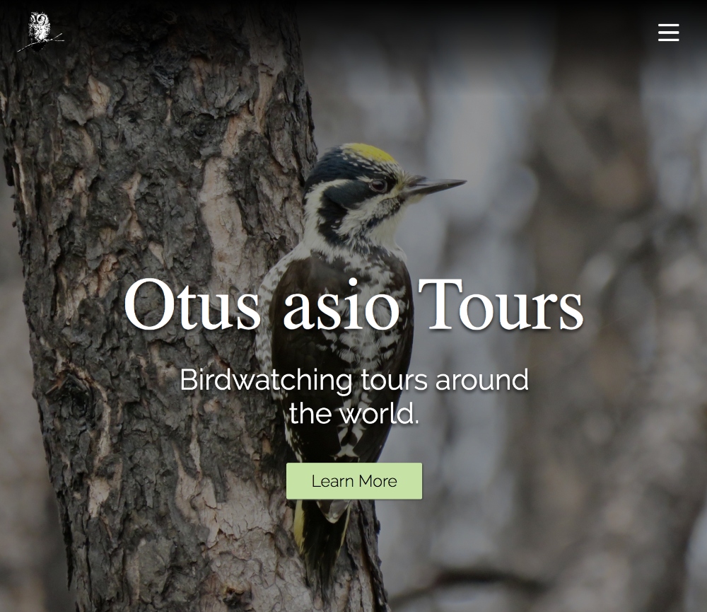
This website was built for a client who leads birdwatching tours around the world. The client already had a website, but was looking for an updated site with a simple, responsive design that would allow him to better promote upcoming tours and provide additional information regarding the tours and his business. He was also hoping that this new site would give him a space to showcase his photography. He hoped to make the images that he took on his trips a central component of the website, by including more photos across the site as well as a photo gallery for each past trip.
Process:
Before beginning the build, I started by creating a detailed design mockup for each page in AdobeXD that used more images on all of the pages and a more natural color palette that includes a variety or greens as well as elements of gray. The update design was responsive and would function on mobile as well as on desktop. The most important part of this site to the client was the images so I made sure to showcase a variety of images on every page. Once that was complete and the client had approved the new design, I built out all of the pages as static web pages using HTML, CSS and Javascript. The site contains a new page to view all trips where the user can click into each trip and view information such as a trip summary, date, leader, itinerary and a map of all of the locations visited throughout the trip. The map component of the site uses Google Maps to create custom maps and then I embed each map using an iframe. The updated past trips page holds cards for each past trip, each of which links to a page with a photo gallery and full checklist for that trip. The footer contains a list of the first 6 upcoming trips, which is dynamically generated using a Javascript object that contains a trip name and a trip URL.
Technologies Used:
- AdobeXD
- HTML
- CSS
- JavaScript
www.katiewrennhansen.com